Most ecommerce teams obsess over cart abandonment, but a large part of lost revenue disappears earlier: on product pages, before a shopper ever adds an item to the online shopping cart.
The average cart abandonment rate is 70.19%, according to widely cited benchmark research from Baymard, while 69.8% is the average checkout abandonment rate across industries. Those numbers are painful, but they only describe shoppers who made it far enough to show clear purchase intent. Many potential customers leave earlier because the product page did not answer a question, build trust, justify the price, or make the next step obvious.
Product page abandonment is different from shopping cart abandonment and checkout abandonment. It happens when online shoppers view product pages but never click “Add to cart.” SalesLeak focuses on this silent stage by capturing shopper friction on product and checkout pages, then turning hesitation signals into AI friction themes, sales-at-risk estimates, and fix suggestions.
Here is what you will learn:
- How to measure product page abandonment accurately
- Why shoppers leave before adding products to shopping carts
- Which UX, trust, pricing, and content fixes move conversion rates
- How to use real-time feedback and ai powered tools to reduce cart abandonment downstream
Product Page Abandonment vs. Cart & Checkout Abandonment
Product page abandonment happens when a visitor views a product detail page and leaves without adding the item to cart. Cart abandonment happens when a shopper adds an item to the cart but leaves before starting or finishing checkout. An abandoned checkout happens after the checkout process begins but before completed transactions.
Each metric reflects a different level of intent in the customer journey. Someone leaving a product page may still be comparing options or window shopping. Someone abandoning the checkout page may want to purchase immediately but is blocked by shipping fees, account creation, payment details, or a complicated checkout process.
- Product page abandonment: A shopper lands on a Nike Air Max product page on a Shopify store in March 2026 and leaves without clicking “Add to cart.”
- Cart abandonment: A shopper adds shoes to the cart, sees high shipping costs, and exits before the payment page.
- Checkout abandonment: A shopper enters a shipping address, reaches the checkout screen, but leaves during the payment process.
- Checkout abandonment occurs when the user starts checkout but does not complete purchase.
- Product pages need clarity, value, and trust. The checkout flow needs speed, flexible payment options, and fewer form fields.
The average cart abandonment rate has stayed around 70%–71% across many 2006–2023 studies, and the shopping cart abandonment rate remains stubbornly high. But product page abandonment is often even higher and less measured. Shopify benchmark datasets show many online retailers have add-to-cart rates in the mid-single digits, meaning most visitors never enter the checkout funnel.
Reducing product page abandonment improves the entire purchase funnel. When product pages answer doubts earlier, you create better-qualified carts, fewer abandoned carts, and a smoother checkout experience across the ecommerce site.
How to Measure Product Page Abandonment (So You Can Actually Reduce It)
You cannot learn how to reduce product page abandonment if you only monitor cart abandonment rate, checkout abandonment rate, or total sales. You need to track the step before the cart.
Use this formula:
Product page abandonment rate = 1 – (sessions with add-to-cart from product page ÷ sessions with product page view) × 100
For example, if your ecommerce store had 12,400 product page sessions in April 2026 and 3,100 sessions produced an add-to-cart, your abandonment rate is:
1 – (3,100 ÷ 12,400) × 100 = 75%
That means three out of four visitors left before entering the online shopping cart.
To set this up:
- Track a product_view event when customers interact with a product page.
- Track an add_to_cart event when they click the main CTA.
- Use Google Analytics 4 ecommerce events or your ecommerce analytics setup to compare the two.
- Segment by mobile devices, desktop, paid social, organic search, email, and product category.
- Watch product page bounce rate, scroll depth, time on page, search bar usage, and variant clicks.
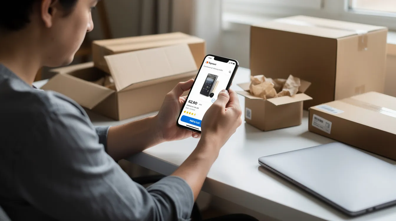
Mobile shoppers need special attention. Mobile users experience higher cart abandonment rates than desktop users, and mobile optimization is essential for user-friendly shopping experiences. If your mobile checkout and product page layout are weak, your online shopping experience will leak revenue before checkout even starts.
The Real Reasons Shoppers Abandon Product Pages
Most brands guess the wrong reason people leave. They assume “price too high” or “need discount codes,” when the real blockers are often confusion, missing information, weak proof, or anxiety about the next step.
Shopper friction is anything that makes the purchase process feel risky or hard. Backend analytics show where user behavior drops off, but they do not explain why. That is where on-page feedback and SalesLeak’s exit listener help.
Common conversion blockers include:
- Missing details about sizing, materials, compatibility, or ingredients
- Unclear shipping costs, shipping fees, taxes, or delivery expectations
- Slow pages, poor layout, weak navigation, or hidden calls to action
- Lack of reviews, trust signals, or policy clarity
- Fear of a long, complex checkout process later
1. Missing or Confusing Product Information
Detailed descriptions enhance user understanding of products. When product information is thin, shoppers hesitate.
Common gaps include:
- Apparel pages with size charts hidden behind tiny links
- Electronics pages that do not list cable types, ports, or compatibility
- Skincare pages missing ingredients, routines, and allergy guidance
- Home goods pages with no dimensions, scale photos, or material details
- Variant-heavy pages with no “Model A vs. Model B” comparison
High-quality images build confidence in product detail pages, but copy still has to answer practical questions. A vague “premium everyday jacket” is weaker than “waterproof hiking jacket with 20,000mm rating, sealed seams, and underarm vents.”
Use support tickets, reviews, and SalesLeak exit feedback to expand FAQs directly on the product page. If five shoppers ask, “Will this fit a 2019 MacBook Pro?” the answer belongs on the PDP, not buried in support.
2. Price, Fees, and Perceived Value Mismatch
Unexpected fees can lead to checkout abandonment. Unexpected fees cause 61% of cart abandonments, and research also shows nearly half of cart abandonment is tied to surprise costs such as taxes, shipping, and fees.
The fix is not always a lower price. It is clearer value.
Try this near the price:
- “Ships free over $49 within the US”
- “Flat $5 shipping, 2–5 business days”
- “VAT included”
- “2-year warranty included”
- “Lasts 2x longer than generic filters”
For apparel, show fabric, fit, and return flexibility. For home goods, show durability and scale. For electronics, show warranty, compatibility, and what is included in the box.
You can use discount codes carefully, but do not train users to wait for promotions. A clear “10% off first order, valid through July 31, 2026” is better than constant popups that weaken perceived value.
3. UX Friction: Layout, Navigation, and Load Speed
Reducing product page abandonment requires user experience optimization. Even interested shoppers leave when product pages are slow, cluttered, or hard to navigate.
Watch for:
- Tiny “Add to cart” buttons below the fold
- Carousels hiding key images
- Popups covering details
- Modals blocking size charts
- Layout shifts that move buttons as the page loads
- A search bar that is hard to find on mobile
Streamlined navigation minimizes friction on product pages, and clear calls to action must be prominently displayed. Keep the primary CTA sticky on mobile, prioritize fast loading for the main product image, and remove heavy scripts that do not support customer engagement or sales.
4. Trust, Social Proof, and Risk Perception
Data security is a high priority for online shoppers. Displaying security badges can boost customer confidence, especially near the CTA and checkout button.
Trust starts before the checkout page. Nearly 9 in 10 customers remain loyal to trusted brands, so trust is not just a conversion tactic; it is a retention asset.
Use:
- Recent reviews with real dates, such as “May 2026”
- Verified buyer badges
- Customer photos and UGC
- SSL/HTTPS signals
- Recognizable payment logos
- “30-day free returns”
- “Ships from our Ohio warehouse in 24 hours”
Social proof reduces shopper doubt and builds trust. A DTC skincare brand should show real skin types, routines, and ingredient explanations. A niche electronics store should show compatibility, warranty, and damage-free shipping proof.
SalesLeak can surface trust objections directly, such as “Not sure if this site is legit” or “Worried about shipping damage.”
5. Checkout Expectations and Early Friction Signals
Shoppers scan product pages for clues about the future checkout experience. They want to know whether the entire checkout process will be fast, secure, and flexible.
Show key reassurance above the fold:
- apple pay, google pay, PayPal, cards, and other digital wallets
- “Fast 3-step checkout”
- “No account required”
- “Secure checkout powered by [payment provider]”
- Delivery estimate and return policy
Flexible payment options enhance purchasing ease, especially when the shopper wants their preferred payment method. If shoppers expect a long checkout, they may never add to cart. That increases product page abandonment, online shopping cart abandonment, and checkout abandonment later.
A streamlined checkout flow improves conversion rates, while 21% of shoppers abandon carts due to complicated checkout processes. 21% of cart abandonments are due to complicated checkout processes. Make the next step feel safe before they click.
Using Real-Time Shopper Feedback to Diagnose Product Page Drop-Off
Analytics show what happened. Feedback explains why.
An exit listener is a lightweight prompt triggered when a shopper is about to leave a product or checkout page. SalesLeak asks one concise question at the moment of hesitation, such as:
“What is stopping you from completing the order?”
Then AI friction analysis groups responses into themes like clarity, price, trust, UX, and delivery. AI can analyze customer behavior to reduce cart abandonment. 82% of business owners use AI to enhance customer experience, and ai powered tools can turn raw shopper comments into a prioritized fix list.
AI-driven systems can recommend products based on browsing patterns. AI can automate personalized email follow-ups for abandoned carts. Using AI can yield a 5-8x return on marketing spend when it helps teams target the right friction instead of guessing.
Fixing Product Page Friction: High-Impact Changes You Can Make This Quarter
Once you measure abandonment and collect shopper feedback, do not overhaul the entire catalog. Start with your top 10–20 SKUs or highest-traffic product pages.
Focus on:
- Copy clarity
- Better visuals
- Pricing and shipping transparency
- Cleaner layout and CTA flow
- Trust elements near the action point
Use A/B tests where possible, then roll out winning patterns.
Rewrite and Re-Structure Product Page Copy
A weak product description says: “Premium backpack for daily use.”
A stronger version says: “Weather-resistant 22L laptop backpack for commuting, weekend trips, and carry-on travel.”
Use this structure:
- Short problem-focused intro
- 3–5 benefit bullets
- Detailed specs
- Usage instructions
- FAQ based on SalesLeak feedback
For fashion, clarify fit and sizing. For appliances, show wattage, dimensions, and setup. For beauty, call out ingredients, skin types, and routine order.
Align copy with search intent. If new customers arrive from “waterproof hiking jacket 2026,” the first lines should confirm the waterproof rating and use case.
Upgrade Visuals: Photos, Video, and Proof in Context
Poor images create doubt. Add 5–8 high-resolution photos per product:
- Front, back, side, and detail shots
- Product in real-life context
- Scale references, such as a lamp on a desk
- Model details, such as a 6’1” model wearing size L
- Closeups of texture, ports, labels, or stitching
Short videos and 360° views help shoppers understand the product faster. UGC galleries combine visuals with proof, showing real customers using the product in normal settings.

Clarify Pricing, Promotions, and Shipping From the Start
Transparent pricing can decrease unexpected fees at checkout. Place shipping and promotion details beside the price, not only inside checkout.
Examples:
- “Ships free over $49”
- “Spend $8 more to offer free shipping”
- “Flat $5 shipping, 2–5 business days”
- “VAT included”
- “15% off with code SUMMER15, valid through July 31, 2026”
Clear rules reduce surprise and improve the checkout experience. They also help reduce shopping cart abandonment because shoppers are not shocked later by shipping costs.
Streamline the Path From Product Page to Cart and Checkout
Your product page should make the next step obvious.
Use:
- High-contrast “Add to cart” and “Buy now” buttons
- Sticky CTA bars for mobile shoppers
- Fast cart confirmation that does not cover key information
- Minimal upsell modals
- Clear progress indicators after checkout begins
Offering guest checkout can reduce abandonment rates significantly. Offer guest checkout options and guest checkout options so shoppers do not get blocked by account creation. You can also offer guest checkout, autofill the shipping address, and simplify payment information fields.
Test “Buy now” for popular products and measure impact on checkout conversion rate, abandoned checkout sessions, and completed transactions. The goal is to reduce checkout abandonment without creating a rushed or confusing payment page.
Reinforce Trust and Policies Near the CTA
Do not bury risk reducers in the footer. Put them near the button:
- “30-day hassle-free returns”
- “Secure checkout”
- “2-year warranty”
- “Ships in 24 hours”
- “Encrypted payment details”
Recognizable security and payment logos reassure shoppers before the payment process. This helps ecommerce businesses maximize conversions by providing customers with the confidence to move forward.
SalesLeak data often reveals fear-based objections like “What if it does not fit?” or “Hard to return?” Answer those objections directly beside the CTA.
Testing, Monitoring, and Iterating Over Time
Product page abandonment is not fixed by one redesign. Treat it like checkout optimization: measure, test, learn, repeat.
Monitor monthly:
- Product page abandonment rate
- Add-to-cart rate by device
- Cart abandonment rate
- Checkout abandonment rate
- Revenue per product page session
- Lost sales and lost revenue by friction theme
Run 2–4 week tests on headlines, images, shipping messages, CTA placement, reviews, and policy microcopy. Combine quantitative user behavior with feedback from exit surveys, reviews, and support.
Retargeting campaigns remind users of products they viewed. Retargeting ads can remind customers of abandoned carts. Exit-intent pop-ups can offer discounts to users about to leave, but use them carefully so they do not interrupt serious buyers.
Recovery still matters downstream. Sending abandoned cart emails can achieve over 40% open rates. Abandoned cart emails can achieve open rates over 40%. Sending two to three emails can enhance engagement, and personalized emails can significantly increase conversion rates. Including discount offers in emails can boost recovery rates. Offering discounts can encourage customers to complete purchases. SMS reminders have an open rate of nearly 98%. SMS reminders have a nearly 98% open rate.
How SalesLeak Helps You Reduce Product Page Abandonment (and Everything Downstream)
SalesLeak is a lightweight exit listener for ecommerce stores. It captures shopper signals when people hesitate or leave product pages, carts, and checkout.
The workflow is simple:
- Install the snippet
- Configure one-question prompts on key product and checkout pages
- Collect real-time feedback
- Let AI group answers into friction themes
- Review sales-at-risk estimates and practical fix suggestions
This goes beyond generic analytics. Instead of only seeing that online purchases failed, you learn why shoppers did not add to cart: confusing sizing, slow delivery, weak trust, unclear shipping, poor photos, or price doubts.
For founders, marketers, and CRO agencies, SalesLeak helps prioritize PDP rewrites, trust improvements, and fixes that reduce cart abandonment. It also supports better abandoned carts recovery because you know which objections appeared earlier in the funnel.
If you want to learn how to reduce product page abandonment, start with 3–5 of your highest-traffic product pages. Run SalesLeak for 14 or 30 days, identify the biggest friction themes, and fix the leaks before they become cart abandonment, checkout abandonment, and lost revenue.